We were so excited to be featured in The Kitchn for their piece on dining room color and small-space design! The journalist reached out after sharing a photo of her own dining room — a gorgeous Connecticut space with beautiful bones that was being weighed down by a very dark, very heavy farmhouse furniture set. She asked for specific guidance to help open up the space, along with universal do’s and don’ts for making a cramped dining room look bigger. This is genuinely one of my favorite design challenges to solve, and the conversation went deep into the nervous system, biophilic design, and why your matching furniture set might be working against you.
Publication: The Kitchn
Article Title: I Showed a Photo of My “Cramped” Dining Room to 2 Designers, and Their Color Tricks Made It Feel 20x Bigger
Publication Date: March 26, 2026
Author: Lauren Brown West-Rosenthal
The Kitchn asked designers to analyze the writer’s cramped-feeling dining room and provide specific guidance on how to make her dining room feel larger along with universal principles that apply to any dining room that feels smaller than it is.
Why Dining Rooms Feel Heavy (And Why It Matters More Than You Think)
When The Kitchn asked me to weigh in on this dining room, here’s the perspective I shared — and the fuller picture behind it:
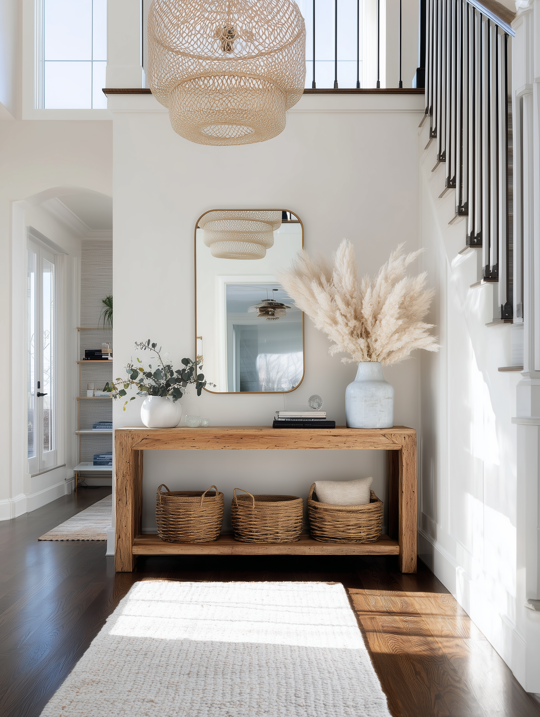
Looking at this dining room, I can immediately identify what’s happening. The bones are genuinely lovely: warm hardwood floors, beautiful crown molding, a gorgeous generous window. But the very dark farmhouse table, chairs, and bench are absorbing light and making the space feel heavier and more closed-in than its actual footprint warrants.
Here’s what most people don’t realize: that heaviness isn’t just an aesthetic problem. Our nervous systems are constantly reading our environments. A dining room that feels cramped or visually dense creates low-grade stress that affects how we show up at the table — how we connect, how we eat, and how we decompress at the end of the day. The dining room is one of the most relationally important spaces in a home, and color is easy to use and one of the most powerful tools we have to shift how it feels to be in it.
The goal is to balance bringing in coziness without tipping into oppressive. That requires careful, deliberate choices that honor both sides of the tension at once.
Why This Tension Matters:
Cozy vs. Open: These two things are actually in opposition, and the best dining rooms have to solve for both simultaneously. Too much contrast and the room feels chaotic. Too little and you’re back to the heavy block.
Visual Weight: When all the furniture sits in the same dark value range, the room stops reading as individual pieces. It reads as one mass.
Nervous System Response: A cramped, heavy room signals — subconsciously — that there isn’t space to linger. An open, warm room says stay a little longer. That’s not just aesthetics. That’s design’s effect on your nervous system.
The Best Wall Colors for a Cramped Dining Room
The existing creamy warm white in Lauren’s room is actually a solid foundation. In general, I recommend soft, light-to-medium tones with warm or muted undertones. Here’s what consistently works:
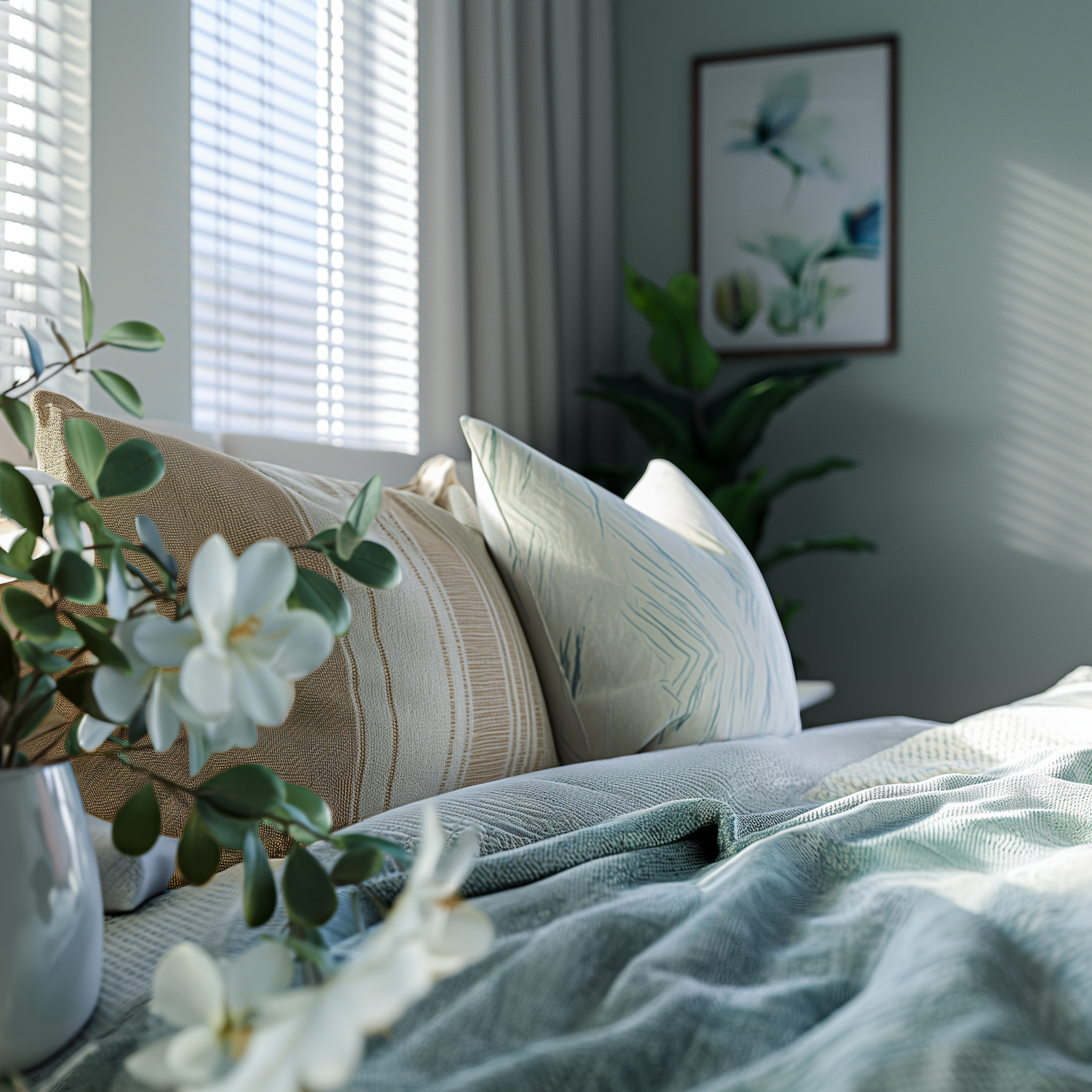
Muted greens are my first recommendation for almost any dining room with dark furniture and warm wood floors. They soften the contrast rather than fighting it, and they’re rooted in biophilic design — humans are neurologically wired to find green spatially expansive and calming. It references the natural world and signals safety to our nervous systems.
Creamy warm whites brighten the room without making it feel stark and clinical. Benjamin Moore White Dove is one of my absolute favorites — it’s warm without being yellow and bright without being cold. It also provides a lovely neutral base for you to design in whatever direction is calling you!
Warm taupe and greige — sometimes called “mushroomy greige” — offer slightly more depth than white for those who want more visual interest on the walls without adding weight.
What to Avoid:
- Overly stark or cool whites — these flatten a space and strip it of the warmth that makes a dining room feel like a place worth gathering in
- Matching everything in the same value range — the wall color and furniture color need counterpoint, not competition
- Undersized lighting — the fixture is part of the color story; a small pendant that pools light downward makes every color in the room read flat
The Furniture Color Conversation
Wall color is only part of the equation. The furniture color matters just as much — often more.
When the table, chairs, and bench all sit in the same dark value range, the room reads as one heavy block. Here’s how to interrupt that pattern without a full furniture overhaul:
Introduce lighter seating. Chairs in a medium warm wood, cane, or upholstered in flax, cream, mushroom, or soft sage break up the visual density immediately. A chair with curves and open areas lightens the visual weight of the room in a way a solid dark chair simply cannot.
Even lighter seat cushions move the needle. You don’t need to replace the chairs, you can start with cushions in a warm neutral. That single change can shift the entire room.
Consider one or two accent chairs in a contrasting finish. Even mixing two chairs at the heads of the table in a lighter material creates the visual rhythm the room is asking for.
Before Any Furniture Decision — Consider Your Table Size:
This is advice I give often and it changes everything: before you invest in paint or new chairs, ask whether your dining table is actually the right size for everyday life. A table with leaves — one that lives at a smaller footprint day-to-day and expands when you’re hosting — gives you far more flexibility and changes the entire feel of the room from an ordinary Tuesday to a lively dinner party on Saturday.
The Rug: Non-Negotiable
For any dining room, a rug is a must. Full stop.
In a room with dark furniture on warm wood floors, a rug does three things simultaneously: it visually lifts the floor plane and separates the dining zone from the surrounding floor color, it introduces a new layer of color and pattern, and — this is the one most people don’t think about — it softens the acoustic environment.
Hard floors and heavy furniture create an echo chamber. That echo registers as subtly stressful during everyday use, let alone dinners with a full table of people. A rug absorbs sound, reduces echo, and makes the space feel calmer and more intimate. Your nervous system will notice before your ears do.
For This Room Specifically:
A botanical-patterned rug extends the nature story from floor to ceiling. A cream-and-sage or cream-and-terracotta botanical weaves color in without competing with dark furniture, and softens the warmth of the wood floors underneath rather than fighting it.
The Sizing Rule That’s Easy to Get Wrong:
All chair legs — including when chairs are pulled out from the table — should remain on the rug. For a full-size dining table, that typically means a 9×12 minimum, often larger. A rug that’s too small makes the furniture look like it’s floating, and paradoxically makes the room feel more cramped, not less.
My Favorite Suggestion: Wallpaper the Ceiling
Here’s where it gets fun!
In a dining room with beautiful crown molding — like Lauren’s — the ceiling is already naturally framed. It’s practically begging for a treatment. A soft botanical or textured wallpaper overhead draws the eye upward, which immediately makes the room feel taller and less compressed, while layering in coziness and personality without touching the walls or competing with the furniture below.
From a biophilic design standpoint, a botanical ceiling creates something almost canopy-like — the sensation of being sheltered beneath a living thing. Our nervous systems register this as deeply safe and calming. It delivers the cozy without any of the cramped!
My Top Picks for a Dining Room Ceiling Treatment:
Soft sage or leaf-pattern botanical — for that living, breathing quality that references a canopy overhead
Warm blush or terracotta textured paper — depth and warmth without overwhelming pattern
Soft dusty blue / creative haint blue — references open sky, makes the ceiling feel like it recedes upward; as a Southern designer I love a creative take on the traditional haint blue
Any of these paired with creamy warm white walls below creates a room that feels both intimate and expansive — exactly the tension we’re trying to resolve.
The Light Fixture Is Jewelry, Not Just Light
Your light fixture should be a piece of jewelry in the room. It should inject personality, not just illuminate the table.
A fixture that casts light downward and inward, pools it on the table surface rather than bouncing it around the space — and it flattens every color in the room as a result. Swapping it for something open and airy changes the entire color experience, not just the light level.
For a long dining room: a linear chandelier is my first recommendation. It draws the eye along the length of the space rather than straight down, making a narrow room feel intentional and expansive rather than compressed. My personal favorites are unique and make everyone comment on it – have fun with your lighting! Life’s too short for boring!
The Dimmer Rule — Non-Negotiable:
Put your dining room light on a dimmer and pair it with warm-toned bulbs. Dining rooms serve multiple purposes — weeknight family dinners, homework, dinner parties, slow Sunday mornings — and you need to be able to alter the mood to suit the moment. Color looks entirely different at 30% dimmer than at full brightness. Your nervous system knows the difference even when your eyes don’t consciously register it.
And That Window — Let the Light In
If you have a gorgeous natural light source, use it! Extend your curtains to near ceiling height to elongate the walls, pull them to the sides, and let that light pour in. Light, airy curtain fabric adds an ethereal quality to a dining room that no paint color can replicate.
The Bigger Picture: Your Dining Room Is a Gathering Space
Your dining room is where your household comes together. It’s where the day gets processed, where guests linger after the meal, where memory gets made. When it feels expansive, warm, and alive, people stay. When it feels cramped and heavy, they leave.
That’s not just an aesthetic observation. That’s nervous system design — and it’s at the heart of every intentional interior.
Read the full article on The Kitchn →
Curious to see what else we’ve been featured in? Explore our full collection of press mentions and expert insights on our Press Page.
Ready to create a home that supports how you live and feel?
Our complimentary discovery call is the first step. You’ll share more about your project, I’ll share about our process and we’ll see if we’re the right fit! Click here to inquire and take the first step toward a beautifully intentional home.
📍 Proudly serving Athens, Georgia, Oconee County, Georgia and surrounding communities throughout Northeast Georgia and beyond
💌 Book a complimentary call with us to discuss your project!