We were thrilled to be featured in Homes & Gardens once again for their piece on Emma Roberts’ stunning mustard velvet sofa! Being asked to explain why this bold color choice works so beautifully was perfect—this is where color psychology, texture, and thoughtful styling converge to create spaces that are both striking and livable.
Publication: Homes & Gardens
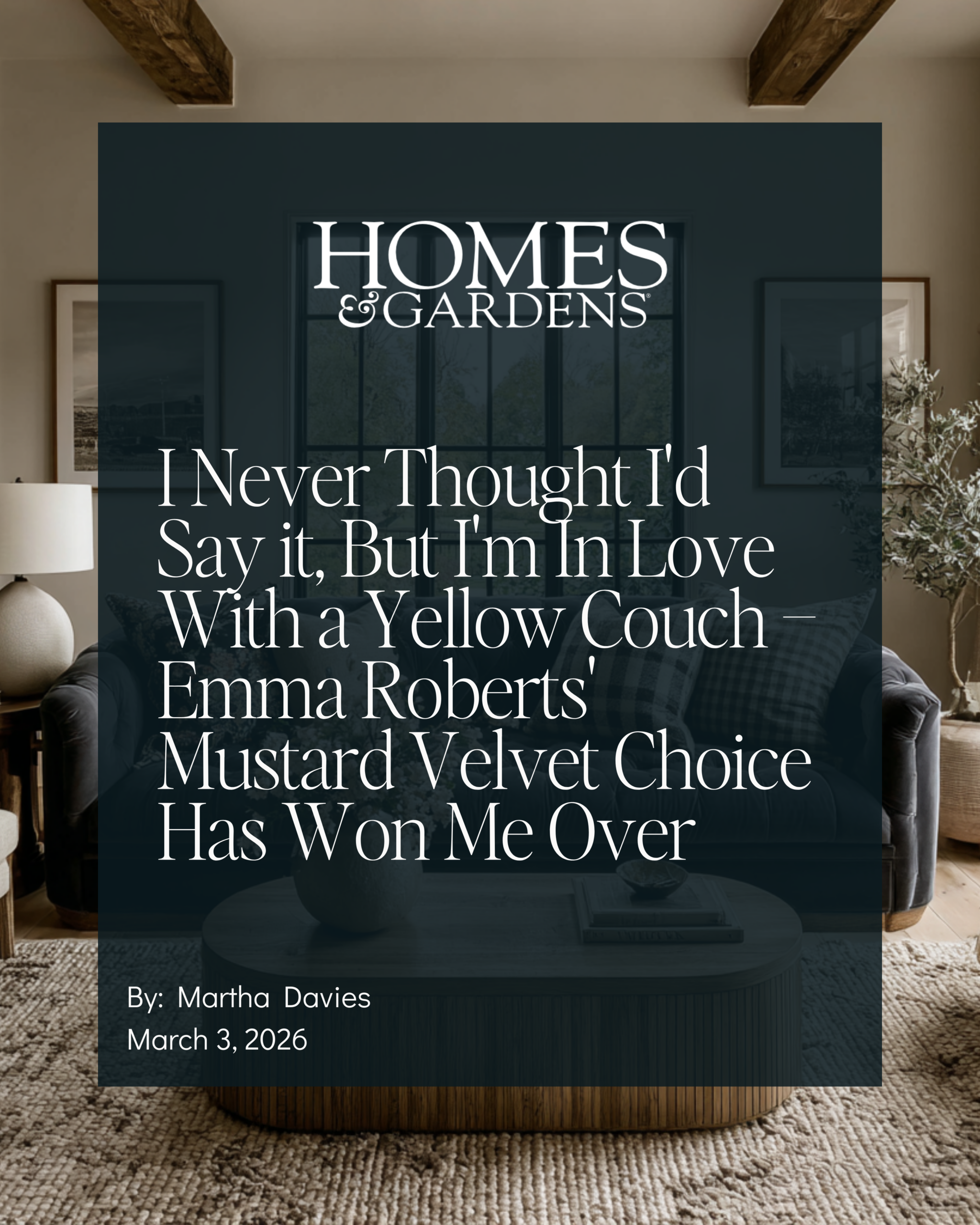
Article Title: Emma Roberts’ Mustard Couch
Publication Date: March 3, 2026
Author: Martha Davies
Homes & Gardens explored Emma Roberts’ beautiful living room featuring a saturated mustard velvet sofa, asking designers to explain why this bold choice works and what makes velvet the perfect fabric for rich, jewel-toned furniture. The article examines both the aesthetic impact and the psychological comfort of this color-and-texture combination.
Why Velvet Makes Mustard Work
When Homes & Gardens asked about Emma Roberts’ mustard velvet sofa, here’s the perspective I shared:
I love this living room! Velvet is doing a lot of the heavy lifting here. It catches the light and shifts tone throughout the day, so the mustard looks rich and dimensional. I personally love the shimmer that velvet has when the light hits it just right. A good velvet instantly makes a saturated color feel elevated, and it’s one of those fabrics that practically begs you to sit down. That soft, touchable texture can make a space feel more calming and restorative.
The Magic of Velvet
Velvet transforms saturated colors in ways that flat fabrics simply cannot:
Light Play: The pile catches and reflects light differently throughout the day, creating depth and movement in the color.
Elevated Perception: Even bold colors read as sophisticated rather than garish when rendered in velvet.
Tactile Invitation: The soft, plush texture creates immediate comfort and approachability.
Visual Warmth: Velvet’s richness adds warmth even to cool-toned colors.
The Supporting Cast: Why the Mustard Doesn’t Overwhelm
What really makes the mustard work, though, is everything around it: the camel and beige pillows, warm wood tones, and creamy walls (plus that beautiful cane-front cabinetry). Those pieces all act like a buffer, so the sofa becomes a statement versus a shock.
The Styling Strategy:
Neutral Foundation: Creamy walls and warm wood floors provide a calm backdrop
Tonal Pillows: Camel and beige bridge the gap between the bold sofa and neutral surroundings
Natural Materials: Cane cabinetry and wood tones ground the space in organic warmth
Breathing Room: Enough neutral elements to let the mustard shine without competing
The Result: A bold statement piece that feels intentional, not overwhelming.
The Color Psychology of Mustard
In color psychology, mustard sits in a sweet spot as a yellow that’s been grounded. You still get the optimism and warmth that yellow brings, but the earthiness keeps it from tipping into overstimulation and makes it more palatable to a wider range of people.
Why Mustard Works Where Bright Yellow Doesn’t:
Optimism Without Anxiety: Pure yellow can be energizing to the point of agitation. Mustard provides warmth and positivity without the nervous system activation.
Grounded Warmth: The brown undertones connect to earth and stability, making the color feel safe rather than jarring.
Sophisticated Saturation: It’s rich enough to make a statement but muted enough to live with long-term.
Universal Appeal: While bright yellow divides people sharply, mustard’s complexity makes it more broadly appealing.
The Evolution: From Mustard to Ochre and Amber
Mustard is evolving and deepening into ochre, amber, and raw umber—all richer tones that carry the same warmth but are viewed as more sophisticated. If you’re considering a yellow-family sofa right now, lean into that deeper honey or amber range. It has more longevity, and it plays beautifully with the earthy, collected interiors that are so popular right now.
The Mustard-to-Ochre Spectrum:
Mustard: Yellow-based with brown undertones, slightly retro feel
Ochre: Earthier, more mineral-like, ancient and timeless
Amber: Honey-toned, warm and glowing, sophisticated
Raw Umber: Deep, rich, almost chocolate-y warmth
Current Trend: Moving toward the deeper, more complex end of the spectrum
How to Use Saturated Color Successfully
Emma Roberts’ Living Room Teaches Us:
1. Choose the Right Fabric Velvet, bouclé, or high-quality linen elevate saturated colors. Avoid flat, synthetic fabrics that can look cheap.
2. Create a Neutral Buffer Surround bold color with neutrals in similar warmth (warm whites, camel, beige, natural wood).
3. Use Tonal Bridges Pillows and accessories in related but softer tones help transition from bold to neutral.
4. Let It Be the Star One saturated statement piece per room. Don’t compete for attention.
5. Ground With Natural Materials Wood, cane, rattan, stone—organic materials balance synthetic color intensity.
Celebrity Homes Getting It Right
Emma Roberts’ living room demonstrates sophisticated color use. The mustard velvet sofa is bold without being risky, warm without being overwhelming, memorable without being trendy. It’s a masterclass in how to incorporate saturated color in a way that photographs beautifully and feels genuinely comfortable to live with.
When celebrities invest in pieces like this, they’re working with designers who understand color psychology, fabric performance, and long-term livability. The result is spaces that support their wellbeing while making a visual impact—exactly what every home should do.
Why This Approach Matters
At The Intentional Design Studio, we believe in color that serves both aesthetics and wellbeing. Mustard and its deeper relatives (ochre, amber, umber) provide warmth, optimism, and grounding—all things our nervous systems crave in uncertain times.
The key is understanding that color never exists in isolation. Emma Roberts’ mustard sofa works because of the velvet texture, the neutral surroundings, the natural materials, and the thoughtful styling. Remove any of those elements and the impact changes dramatically.
This is the difference between bold design that energizes and bold design that exhausts. When you consider texture, context, and psychology—not just “what’s trending”—you create spaces that feel right for years, not just months.
We’re so grateful to Homes & Gardens for the opportunity to explore this beautiful example of saturated color done right!
Read the full article on Homes & Gardens →
Curious to see what else we’ve been featured in? Explore our full collection of press mentions and expert insights on our Press Page.
Ready to create a home that supports how you live and feel?
Our complimentary discovery call is the first step—no pressure, no decisions—just a chance to share more about your project and see if we’re the right fit. Click here to inquire and take the first step toward a beautifully intentional home.
📍 Proudly serving Athens, Georgia, Oconee County, Georgia and surrounding communities throughout Northeast Georgia and beyond
💌 Book a complimentary call with us to discuss your project!